Design Strategy
February 26, 2025

Designing for data-heavy products can feel like a balancing act. On one hand, users love the wealth of information these tools provide, but on the other, too much complexity can lead to confusion and frustration. The goal? Create user-friendly interfaces that simplify the experience while delivering all the essential data.
If you’re looking to design intuitive, actionable, and effective data-heavy products, these strategies have you covered. From progressive disclosure to visual hierarchy in design, here’s how to turn complexity into clarity.
Think about opening a well-organized closet—it’s a world apart from one where every item of clothing spills onto the floor in utter chaos. Progressive disclosure does for interfaces what those shelving systems do for your wardrobe. It organizes and reveals information in manageable layers.
Rather than overwhelming the user with too much data upfront, show only what’s relevant in the moment. Here’s how:
With progressive disclosure, you create interfaces that encourage exploration without overwhelming users, keeping your product approachable and efficient.
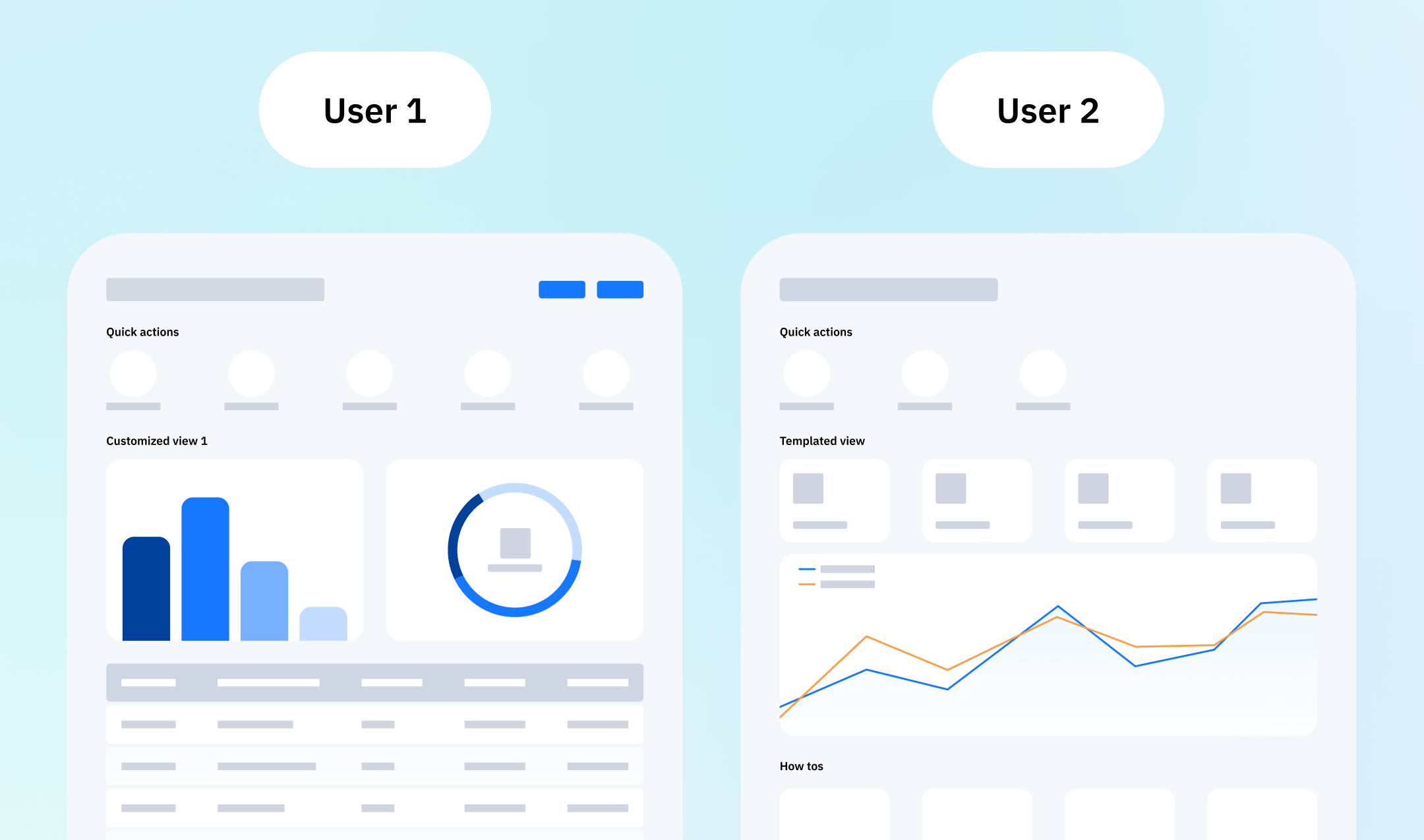
Every user interacts with your product differently, so why design a one-size-fits-all interface? Effective data-heavy product design hinges on understanding your audience. Are they beginners who need guidance or experienced users craving access to advanced features?
By addressing individual user personas, your interface can deliver a deeply personalized and relevant experience.
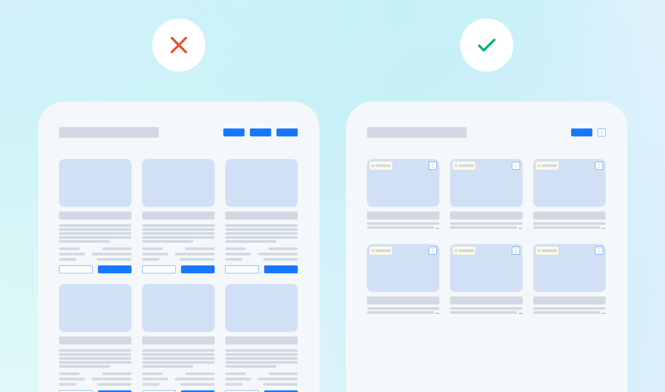
Imagine reviewing a jumbled restaurant menu where appetizers, entrees, and desserts are listed together. It’s exhausting, right? Now think about your data-heavy product—it has to make sense at a glance.
When designing for clarity, logically group related data within your interface. Here’s how to make it work:
The result is a clean, intuitive structure that helps users easily find what they need with minimal effort.

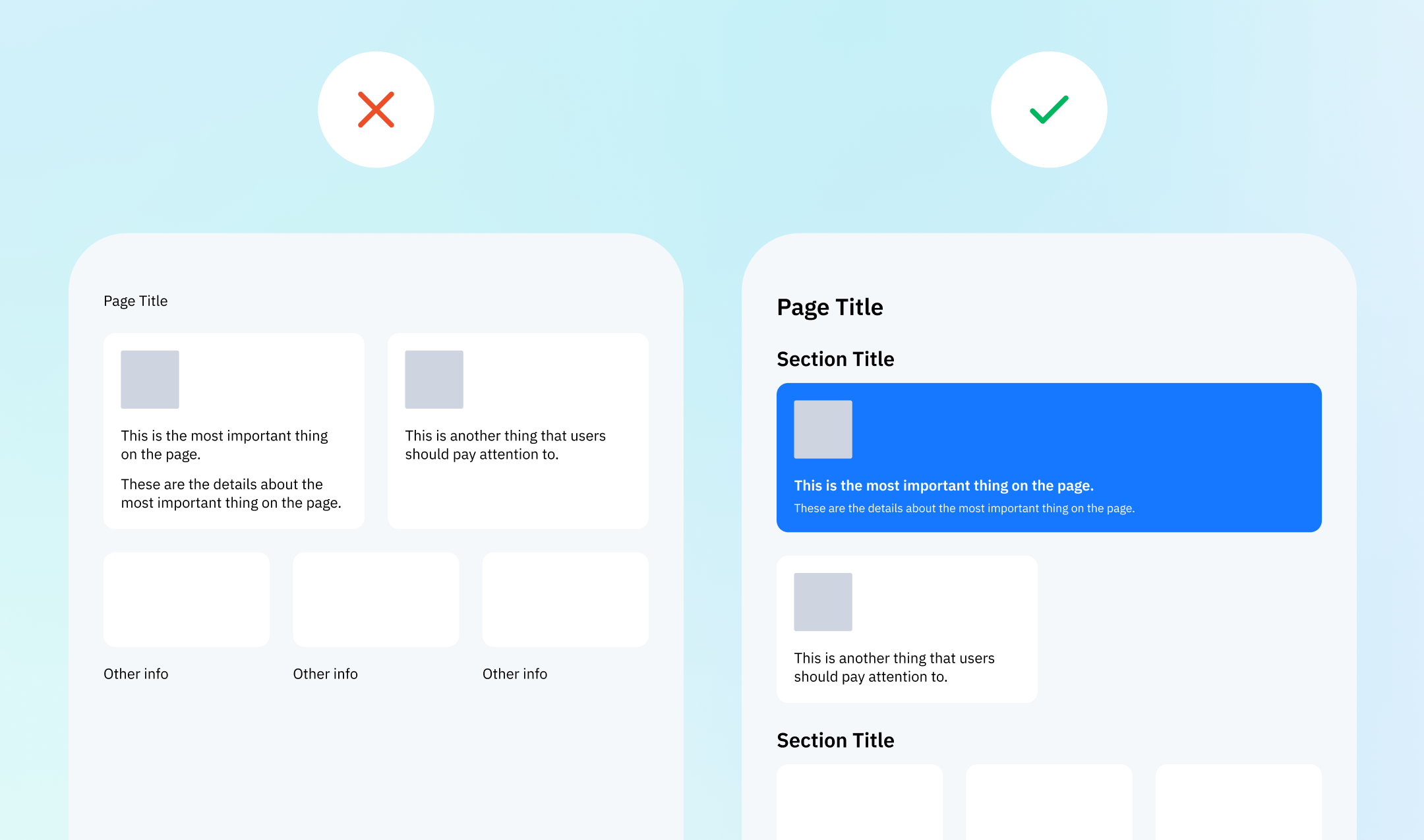
When it comes to prioritizing data, visual hierarchy is key. Think of newspaper headlines that grab your attention first—they guide your reading experience.
For data-heavy product interfaces, highlight critical information using these techniques:
By organizing data with purpose, you help users focus faster, ensuring they extract value from your product without confusion.
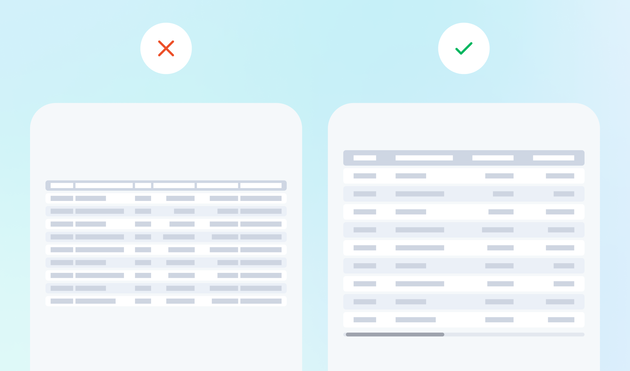
White space—often misunderstood as “empty space”—is one of the most powerful tools in design. It creates breathing room, making dense data layouts feel organized and approachable.
Here’s why white space is essential for data-heavy product design:
Think of white space as the silent ally of good UX—it’s not about what's missing, but how well everything on the page connects.
When done right, designing for data-heavy products doesn’t mean simplifying content or leaving out important details. It’s about strategically organizing and presenting information in a way that feels intuitive and engaging.
Looking to have crazy good UX for your product? Koi Studios specializes in designing intuitive UX for data heavy products. Book a call to learn how we can help.
Related articles
.svg)
.svg)
By subscribing, you agree to receive emails from Koi Studios. Unsubscribe anytime using the link in our emails.